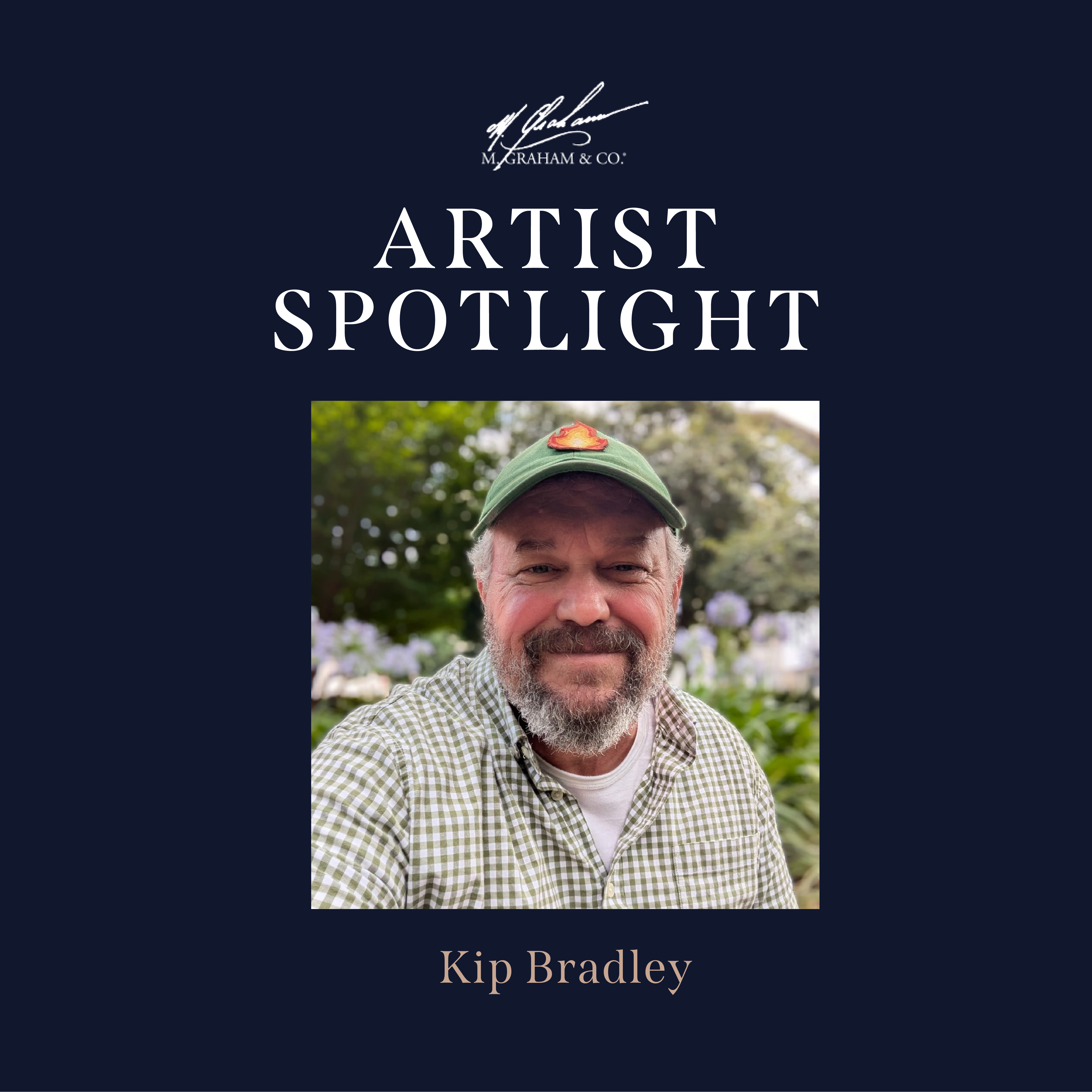
In the Moment: A Conversation with Kip Bradley
For Savannah-based painter and community art educator Kip Bradley, painting isn’t just about color — it’s about presence. It’s about showing up again and again, building consistency, and finding poetry in a single sitting. A longtime user of M. Graham oils, Kip brings the same intentionality to his materials that he brings to his teaching practice, where he works with thousands of students each year.
We spoke with Kip about dyslexia, plein air painting, teaching as service, and why consistency in materials makes all the difference.
When did painting first enter your life?
I’m dyslexic and growing up I was always in resource rooms instead of art classes. My mom was a first-grade teacher and really invested in helping kids like me, so I always had individualized education plans. Art wasn’t really part of my early education.
It wasn’t until my senior year of high school that I took my first art class — a watercolor class. I actually hated watercolor. But I became obsessed with drawing. It felt like a problem I couldn’t solve, and I just kept working at it.
By the time I started college that fall, I switched my major to painting. I had almost no experience, just a few months of drawing. But I haven’t looked back since. I started at the University of New Hampshire, eventually made my way to Savannah, and I’ve been painting for over 30 years now.
How did teaching become such a central part of your career?
By accident, really.
In college I took a mural painting class at a rehabilitation hospital. People recovering from strokes, injuries, vision loss, they could come help paint the mural. I signed up for a shift, and no one showed up after me, so I stayed. Then the next person didn’t show up either. I ended up spending the entire day there.
There was a 100-year-old man in a wheelchair who called me a “whippersnapper.” We laughed for hours. People told me the experience changed their rehabilitation process. I couldn’t believe how easy it was to make such a difference.
After that, I stayed involved and helped develop therapeutic art programs at the Telfair Museums in Savannah. Today, I work with thousands of people each year — from pre-K students to retirees — through studio classes, plein air clubs, and museum programs. Altogether, I get to make art with around 16,000 people a year.
It’s incredible.
Why have you stuck with M. Graham oils?
I started using M. Graham when I was teaching color theory. It was the highest quality, lowest-priced paint I could ask my students to buy. And then I just fell in love with it myself.
For me, it’s about pigment load, viscosity, and consistency. The colors are strong. The paint moves beautifully across the surface. It sits right in the middle, not too thin, not too thick.
I can create transparent washes or thick, luscious, opaque marks. And the walnut oil works perfectly for my pace as a plein air painter. There’s a slight drying time — that tackiness — that’s essential for how I build layers.
It just fits.
And I feel good recommending it to students. It’s a better-quality paint at a lower price point than many other brands. That matters when you’re teaching.
Tell us about your palette.
My teaching palette is very structured — titanium white, naphthol red, quinacridone red, cadmium orange, hansa yellow, cadmium yellow, ultramarine blue, manganese blue, permanent green. It aligns well with the color wheel and supports complementary mixing.
But recently, I made a major shift. I started reading about painters like Robert Henri and John Singer Sargent and thinking about deeper, more romantic palettes.
I noticed I was always mixing toward darker, more saturated colors anyway. So, I switched to more transparent and semi-transparent pigments — iron oxides, transparent oxides, dioxazine violet, viridian.
It gives me a brighter intensity when mixing with white, and more subtle shifts in hue. I can suggest glazing effects or overall temperature shifts in a way that feels richer and maybe more romantic than impressionist.
I’ve only done one painting with it so far — a moonrise at the beach — and it was pitch black. I’m excited about where it’s going.
You work primarily in oil. What keeps you there?
Oil is forgiving.
Watercolor is incredibly hard. I respect it, but I struggle with it personally. Acrylic — I don’t love the viscosity or transparency. I’ve never been able to get it to look like oil.
With oil, I can work almost like watercolor. My first layers are very transparent, almost like a tea consistency. Then I build into milk. Then honey — those thicker, final marks.
I love that flexibility.
Your paintings are completed in a single sitting. Why is that important?
Most of my paintings are done in an hour and a half. Two and a half hours is the long side. And I don’t go back in.
If I do go back, I can always see the new marks. They don’t belong. The light has changed. I’ve changed. The moment has passed.
A lot of what I’m after is immediacy — being present. Putting the phone away. Being in that specific place at that specific time.
Once you leave it, something is lost.
How do you know when a painting is finished?
It feels considered.
I do a quick check — light, middle, dark. Warm, cool, in-between. Big, medium, small. I think in threes.
It’s almost like proofreading. I scan the painting and ask: Does every area have variation? Is anything too flat? Too big? Too uniform?
And then there’s a point where the conversation is over. You can feel it.
Where can people find your work?
My work is at kipbradley.com. I post paintings almost as soon as I make them — usually three to five a week. It’s a way to explore Savannah in real time.
I do a still life every week, landscapes on Fridays, and if I can get out on the weekends, I’ll paint then too.
It’s mostly about staying in the rhythm.
–
For Kip Bradley, painting is less about perfection and more about practice — about showing up with the same materials, the same discipline, and the willingness to respond to a fleeting moment of light. Through decades of teaching and thousands of students, he’s built a life rooted in repetition, generosity, and the quiet intensity of being fully present.
And with every single-sitting painting, that presence is preserved.