At M. Graham, we’re all about color.
Born from our love of the Renaissance masters, we’re dedicated to making long-lasting artists’ color that’s intensely, truly beautiful. We load our paint paste with the highest pigment loads possible and apply traditional milling techniques to achieve outstanding tinting strength and mass tone in all of our fine arts colors.
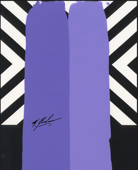
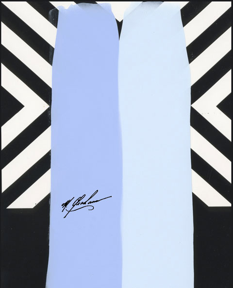
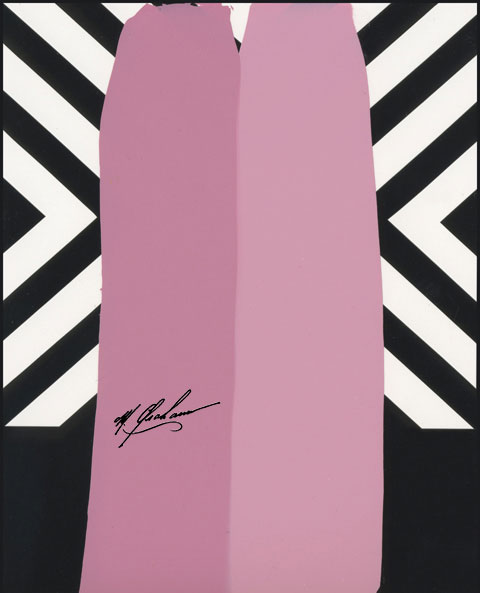
Richer, More Vibrant Color
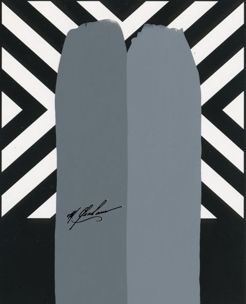
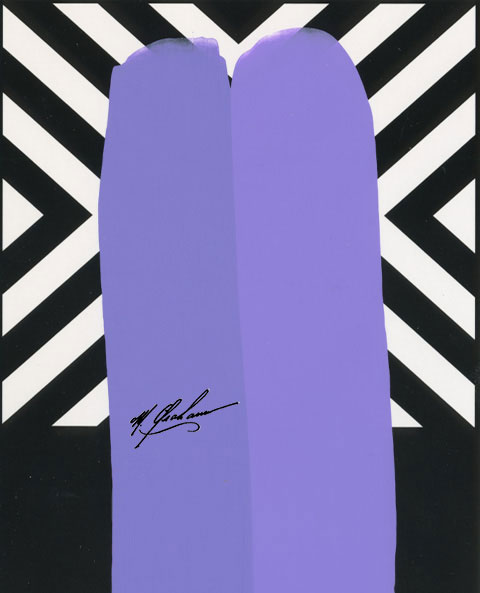
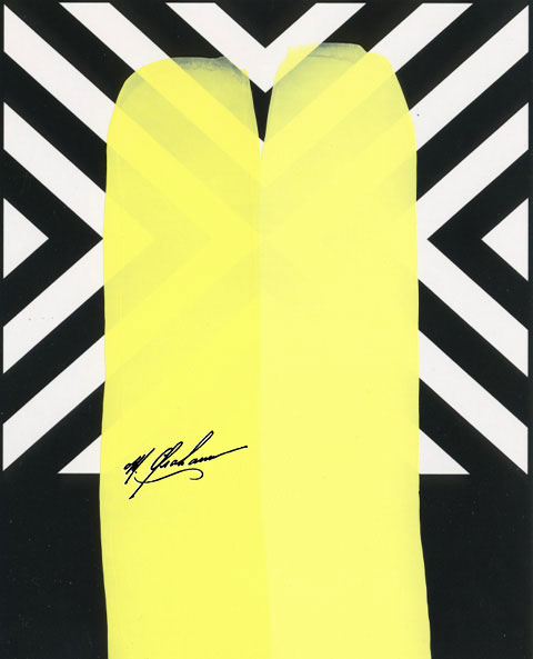
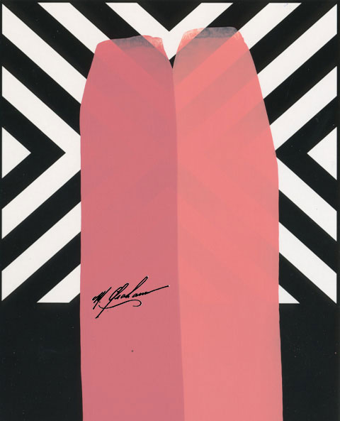
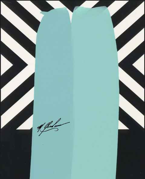
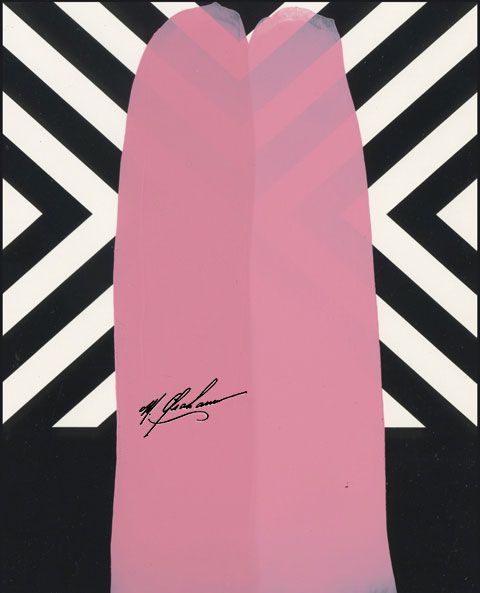
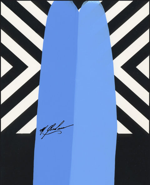
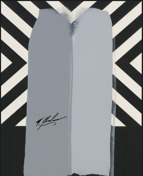
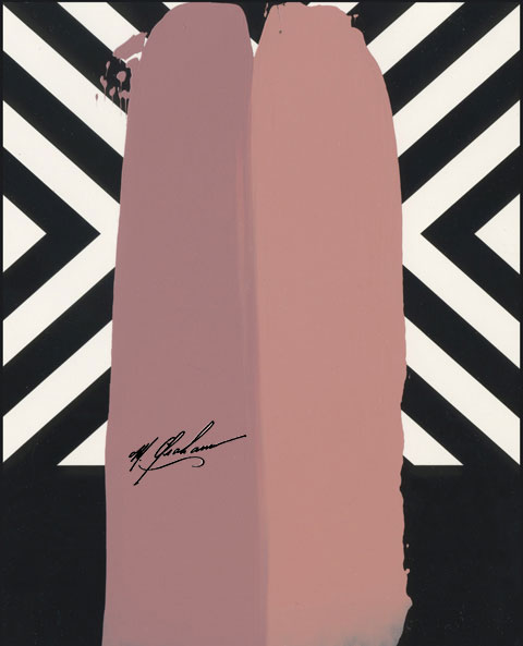
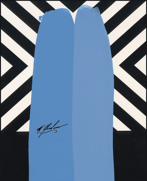
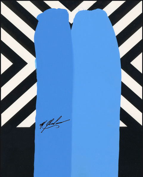
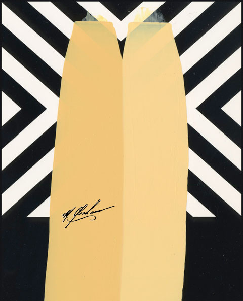
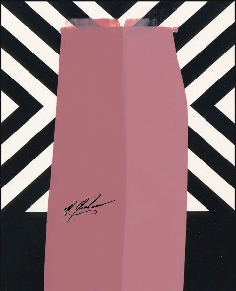
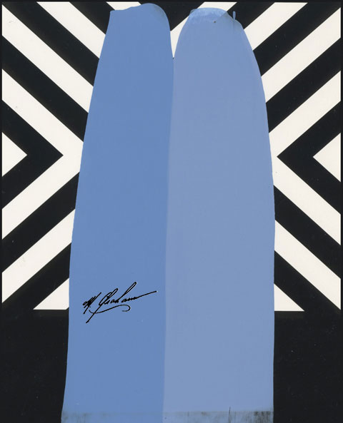
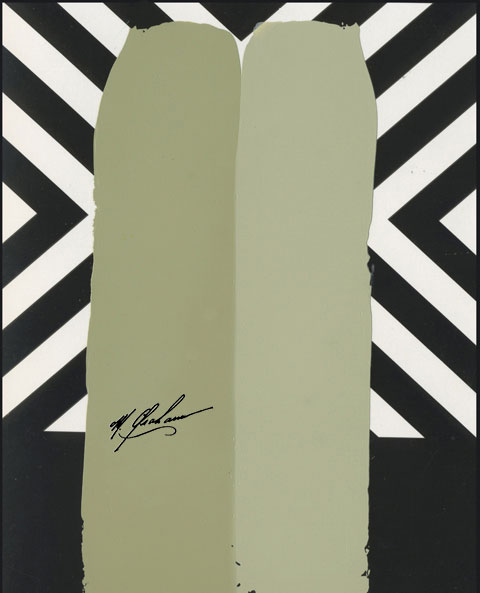
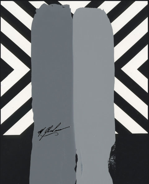
Comparing M. Graham paints shows the difference—our colors are more brilliant, and more vibrant.
For our side-by-side color comparisons, we mix a tablespoon of white with a half-teaspoon of color. We make what we call “draw downs,” and we always put our color on the left, and the competitor’s color on the right.
What we find time and again is that no other paint offers the same level of pigment as ours. But don’t take our word for it. See the M. Graham color difference for yourself!