Acrylic Techniques by Angela Bandurka
Acrylic aficionado Angela Bandurka @abandurkaart breaks down her color mixing and highlighting techniques for her two paintings “Guilty Pleasures” and “Cleaning Up, Blue” in the latest M. Graham blog.
By Angela Bandurka
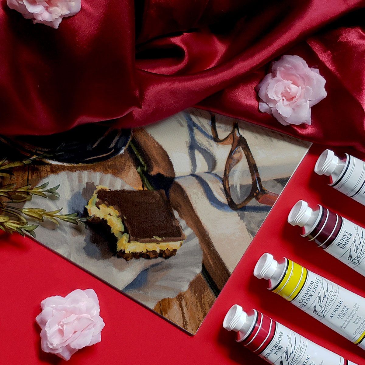
Guilty Pleasures
18 x 24 Acrylic on Canvas, 2018
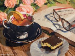
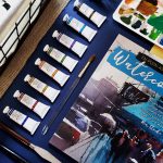
Colors:
Titanium White
Cadmium Yellow Light
Cadmium Orange
Quinacridone Rose
Ultramarine Blue
Burnt Umber
All of the blacks I use are mixes of Ultramarine Blue and Burnt Umber. For my grays, I use the same mixture of colors with a touch of Titanium White. This gives me more control over color temperature in my grays than using black and white.
I don’t use any glazes for my work; I only use direct color, or layering, for dry brushing purposes in my paintings. So, the tea in the cup is painted with the colors and values that I see.
As I near completion in my painting process, I take out a palette knife and abstract the elements in the piece that will draw your eye to the focal point and shift it from the main area of dominance throughout the rest of the work. Examples of this can be seen in the top edges of the book, roses, and wooden table.
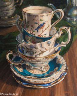
Cleaning Up, Blue
20 x 16 Acrylic on Canvas, 2018
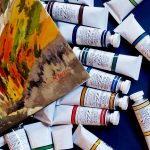
Colors:
Titanium White
Cadmium Yellow Light
Cadmium Orange
Quinacridone Rose
Ultramarine Blue
Cerulean Blue
Hooker’s Green
Burnt Umber
The gold tones seen on the rims of the tea cups are a mix of Burnt Umber with Cadmium Yellow Light, for warm areas, and Cadmium Orange and Titanium White, for the cooler areas. Color temperature helps determine the color of the gold, whether leaning towards an orange tone or towards a yellow tone instead.
To create highlights on the light areas, I have to start by assuming that the highlights will be the lightest elements in the work. With that assumption, all of the other whites used are actually warm or cool grays. When I apply the white, I place a touch of a light cream color over the area I wish to highlight, then I dry brush it upwards in a star pattern, or rub it with my finger, to give it a “glow”. Last, I dollop a thick glob of white in the middle of the highlighted area to finish it!
There are multiple blues being used in this setting, so I mixed Ultramarine Blue and Cerulean Blue each with the different colors in my palette to achieve the look I was going for.
Follow Angela Bandurka:
Website: AngelaBandurka.com
Facebook: ABandurka Art
Twitter: @angelabandurka
Instagram: @abandurkaart
Pinterest: angelabandurka