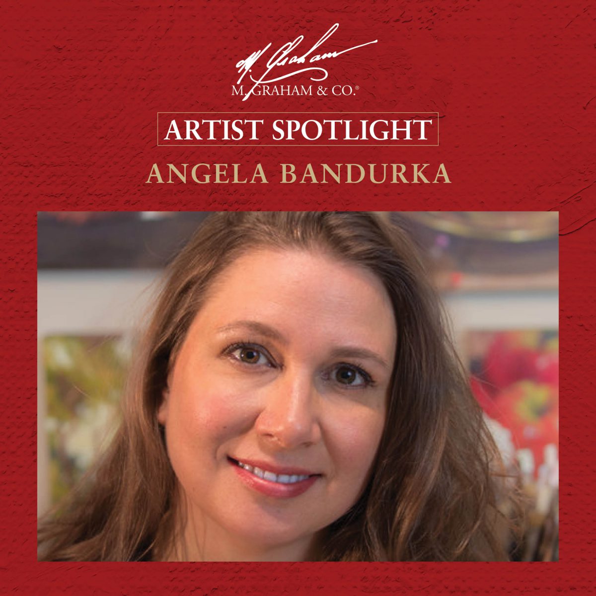
Artist Spotlight: Angela Bandurka
Award-winning acrylic artist Angela Bandurka @abandurka discusses her influences, cherished painting advice, and her color palette philosophy in her interview for the latest M. Graham blog.
-
You tell us your love of art began at a very young age. You even completed your first commissioned portrait at age 15. How did you know you wanted to be an artist?
My grandmother was an artist, and painting just seemed like magic to me. I would touch her paintings, feel the texture, and wish I could paint like that. My parents encouraged me, and, while in elementary school, they signed me up for a drawing class at the public library. I was the only child in the class, and it was exhilarating! Any time I had downtime, you would find me poring over art instruction books and practicing my skills.
-
Who are the biggest influences to your painting style and in what ways?
My grandparents were part of a group that started an art school in Gibsons, B.C. called the Gibsons School of the Arts. Each summer, when I was in my twenties, I would take a week-long workshop with my grandmother. My first teacher there was Mike Svob, who really influenced my use of color and composition, then Greta Guzek, who also focused on color, and Justin Ogilvie and David Goatley, who were figurative artists that helped me with my drawing skills. Nowadays, I’m really intrigued by the works of Richard Schmidt and some of his followers.
-
You come from a long line of passionate artists in your family; with your grandmother being one of your main mentors. What is the most important painting advice you have ever received from her?
The best advice I ever got from my grandma was to “Stop petting the painting”. What that means is, when you get to the point where you feel like you’re petting the painting with your brush, because you can’t help yourself, and you’re not sure what you’re doing, stop. You’re done. Knowing when to be done can be the hardest part of a painting, especially when first starting out.
-
What draws you to acrylic over other painting mediums?
There is an immediacy to painting in acrylic. It’s an opaque media that can deliver exciting texture, but it dries quickly, which allows layers. The easy clean up and lack of flammability are also major benefits, but, really, it’s all about the layering aspect for me.
-
What makes M. Graham acrylics stand out from other acrylic paints you have used?
I was initially very skeptical about trying M. Graham. I’ve tried many acrylic paints and they’ve always let me down. How exciting it was to finally have an alternative to my older favorite, which is just a little too viscous for my tastes, and dried out too quickly. M. Graham is so highly pigmented; the colors in M. Graham acrylic paints are vibrant and make such delicious mixes. The consistency of M. Graham acrylic paints is perfect for my combination of thin layers and thick accents, and it stays wet just a little longer.
-
Which four M. Graham acrylic paints will we always find on your palette?
Cadmium Yellow Light (a cool, opaque light value), Quinacridone Rose (my primary red), Ultramarine Blue (dark and vibrant), and Burnt Umber (helpful for desaturating color), Ultramarine Blue and Burnt Umber (combined to make a wonderful black).
-
What is your philosophy for building the perfect palette?
I want to be able to create a vibrant palette that achieves a wide range of color mixes, along with rich neutrals. It’s helpful to have a warm and cool version of each color handy (although I don’t always paint with all of them), as well as a few secondaries that aren’t as saturated in mixes. Before I settle on a palette for a specific painting, I’ll always do a few color tests in my sketchbook to make sure the palette I choose will be able to yield the results I’m looking for. The palette doesn’t have to match the subject matter, but must be harmonious!
-
Do you prioritize color or value when painting? And why?
Color and value are interconnected so both are very important. I like to think of myself as a colorist, but I prioritize values because I have more freedom to play with color. To me, they are equal partners in a harmonious and rich painting.
-
What is the greatest challenge you have experienced with your art and how do you overcome it?
Always, the greatest challenge is trying to better yourself. How are you going to improve your work and keep yourself from becoming stagnant? That’s my greatest challenge and I’m never sure how to overcome it! That is the joy and angst of the creative endeavor! The best advice I can give is to take yourself out of your comfort zone. Create a piece you’re happy with, then try to see what you can do differently with it. For me, that was adding the palette knife and deconstructing what I’d done a bit. Who knows what it’s going to be next?
Follow Angela Bandurka
Facebook: angelabandurka
Instagram: @abandurkaart
Website: angelabandurka.com


